


Heat Mapping
Create heat maps of numeric concentrations based on record count or any numeric field values.
Oops! Something went wrong while submitting the form.
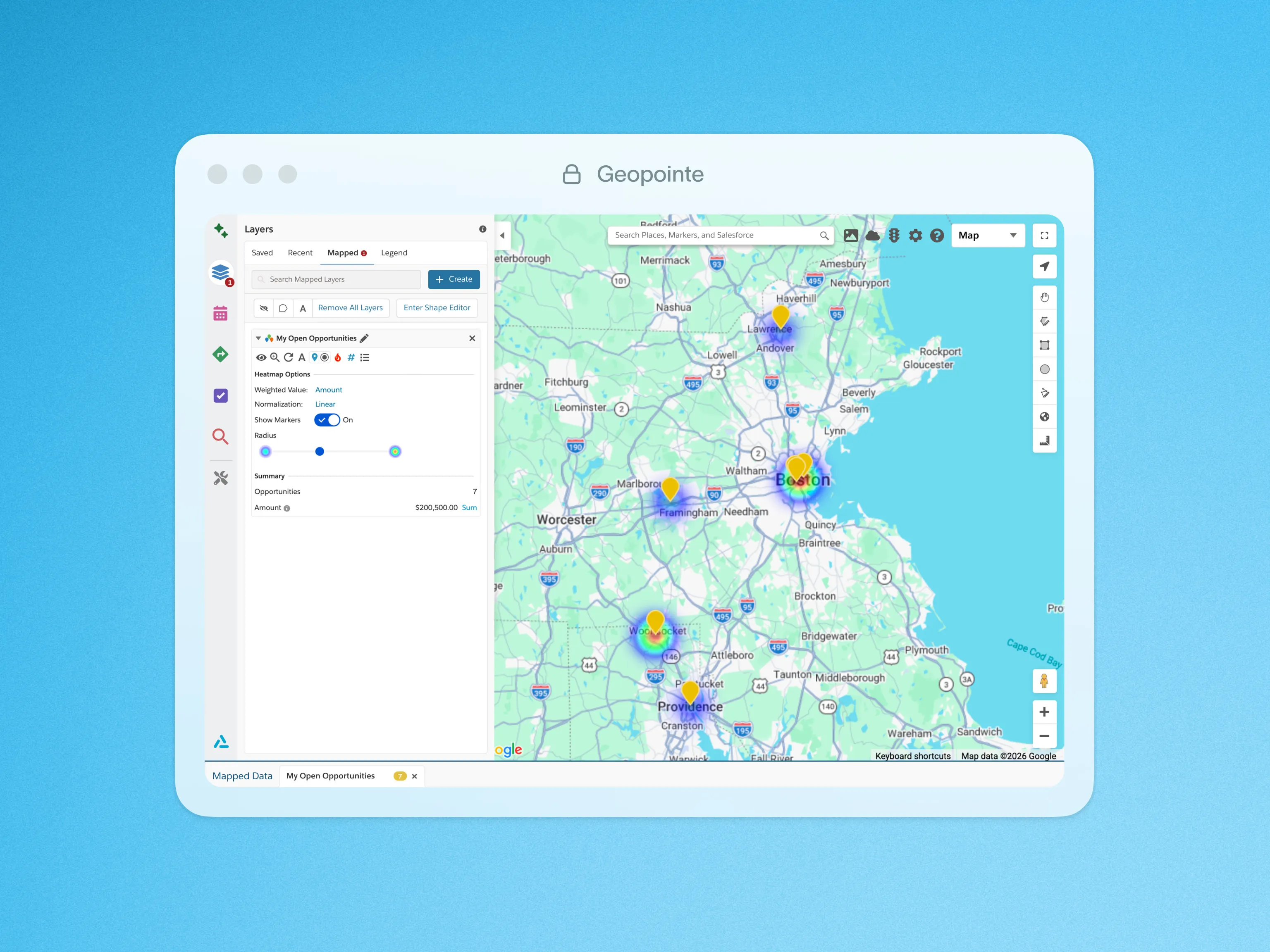
Visualize a heat map of numeric concentrations based on record count or any numeric field values you include with your mapped data.
Heat mapping represents values with color coding so you can make insightful decisions at a glance. View heat maps based on record count or by a numeric field such as opportunity size, annual revenue, employee count or asset size. Layer your heat map with other data or on top of territory boundaries to get insight about gaps, trends or ideal target locations for campaigns or other outreach.
Click below for quick look at heat mapping in action.

.webp)