


Charting
Use interactive charts to analyze mapped data and spot trends without leaving the Geopointe interface.
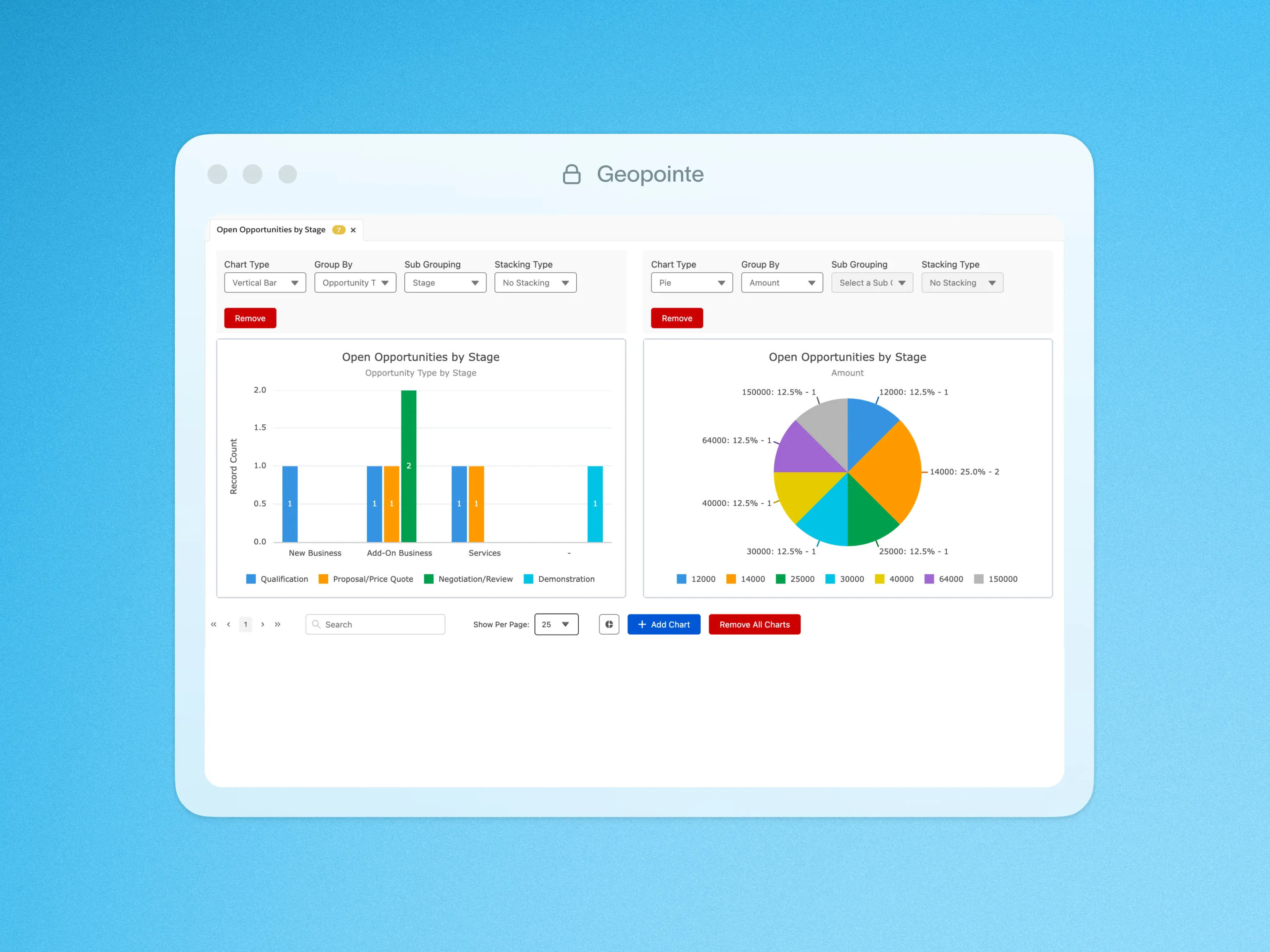
Sometimes you need more than a map to see a picture of your data. Geopointe’s interactive charts enable you to go beyond mapping by offering advanced data visualization directly within the Geopointe interface, eliminating the need for Excel exports.
You can create pie charts, bar graphs, and other visualizations to analyze your data across fields such as state, opportunities, status, account type, and more.
Additionally, with the modernized design including richer visual insights, these charts support more unique legend values and the ability to add multiple charts simultaneously, each grouped by its own unique field and chart type.
This flexibility makes it easy to uncover trends, identify patterns, and transform your data into actionable insights without ever needing an Excel export.

.webp)